
An underlying element in local elite discussion of New Zealand’s COVID-19 experience is along the lines of “didn’t we do well?” We can see this theme in blogs by the public health academics at the University of Otago, Wellington (such as here or here) but also in official government press releases.
Central to this theme is the claim that New Zealand had no excess mortality since lockdowns were imposed in March 2020. As the press release from Chris Hipkins put it “there was not a higher-than-normal death rate in New Zealand over the first two years of the pandemic.”
These claims are incomplete and could distract New Zealanders from an unfolding disaster. The following chart shows excess deaths per week in New Zealand, going back to the start of April 2020. The data and methods used to construct estimates are discussed here. The chart is set so values below the horizontal axis show weeks with fewer all-cause deaths than expected for that week in that year (taking account of seasonality, population growth and other things), and values above the horizontal show more deaths than expected (that is, excess deaths).
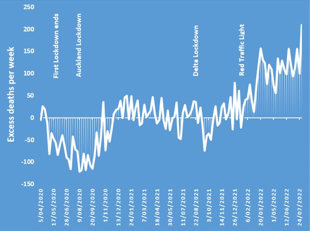
From late April 2020 until late October 2020 there was a continuous run of fewer deaths than expected. This spanned a national lockdown and a later Auckland lockdown being imposed and relaxed. Cumulatively, 1900 fewer deaths than expected occurred (a mortality deficit of about 9%) in the first seven months of the COVID response. The next year saw a slight rebound, so by November 2021 cumulative excess deaths were roughly -1800 (that is, over 20 months there had been a total of about 1800 fewer deaths than expected). Notably this period covered another lockdown, the “delta lockdown” starting on August 17, 2021.
This all began to change from November 2021. Since then, New Zealand went from -1800 cumulative excess deaths to +1150 by the end of July 2022. In other words, in the last eight months there have been almost 3000 excess deaths (which is 13% above what was expected). The surge in excess deaths in 2022 far outweighs the mortality deficit from 2020.
The chart is quite different to the happy-talk from government ministers about New Zealand having no excess mortality. In case anyone doubts the chart, the same pattern is seen at Our World in Data (here) except that source lacks the most recent deaths (which matters as the last week of July 2022 had over 200 more deaths than expected for that week of the year).
What is causing all of these deaths? The new way to count COVID-19 deaths has 1216 deaths from COVID-19 as the underlying cause, going right back to 2020, plus 700 deaths where COVID is a contributory factor. So in the last eight months New Zealand has had over 1000 more people die than expected, where COVID is neither a cause nor a contributory factor. This is more than three times the annual road toll, yet there is no “road to zero” advertising campaign or government strategy about these unexplained deaths.
The same mystery of excess deaths not due to COVID is being noted overseas. There is some speculation of this being delayed effects of various untreated health conditions in lockdowns. I have argued previously that New Zealand’s unusually high sensitivity of life expectancy to income means that long-run indirect effects of lockdowns will see a far greater reduction in life expectancy due to the response to COVID-19, compared to life years lost to the disease.
Nevertheless, I doubt that delayed effects of lockdowns are proximate causes of the surge in excess deaths in 2022. Why now, rather than earlier? Given layering of various lockdowns and traffic light restrictions, tying deaths now to those earlier restrictions is quite difficult.
Instead, it is more likely that some of the unexplained excess deaths are arising from the indiscriminate use of COVID-19 vaccines. It helps to recall that Pfizer documents eventually released by the FDA show that four months after the second dose, the vaccinated group in the Phase 2/3 trial had suffered 25% more all-cause deaths than the number of deaths occurring in the placebo group. Thus, more deaths due to greater use of the vaccines is consistent with results from the clinical trials.
Moreover, there are now several studies which show that vaccine rollout – particularly of the booster doses – is associated with rising excess deaths. Examples where this pattern has been observed include Israel, Germany, and the Netherlands.
To put these country-specific results in broader context, I related country-by-month average excess mortality rates (percentage deviations of all-cause deaths from expected deaths in each country in each time period) to the number of COVID-19 vaccine doses administered per 100 people in the same country-month pair. The analysis covers 35 OECD countries (excluding Turkey, which has no excess mortality data in Our World in Data, and also excluding Costa Rica and Columbia who only joined the OECD in 2020 and 2021). The period covered is for the 19 months from January 2021 (almost no COVID-19 vaccines were administered before then) until July 2022.
In these countries, the mean excess mortality rate is ten percent across these country-month pairs and the mean dosing rate is 118 doses per 100 population (which is very close to the mean for New Zealand over this period, of 115 doses per 100 population). The dosing range goes from zero (for several countries in January 2020) to 310 (Chile by July 2022 had given an equivalent of three doses per person for their entire population).
There is a clear positive relationship between times and places that have greater use of the COVID-19 vaccines and times and places that have higher excess mortality; a one standard deviation (SD) higher rate of doses per 100 people is associated with the percentage excess deaths being 0.7 SD higher (with a 95% confidence interval ranging from 0.2 to 1.1, crucially it excludes zero so the null hypothesis of zero effect can be ruled out). This estimate controls for time-invariant unobserved country factors (e.g. age structure, health system capacity) and space-invariant temporal factors that might otherwise confound the relationship.
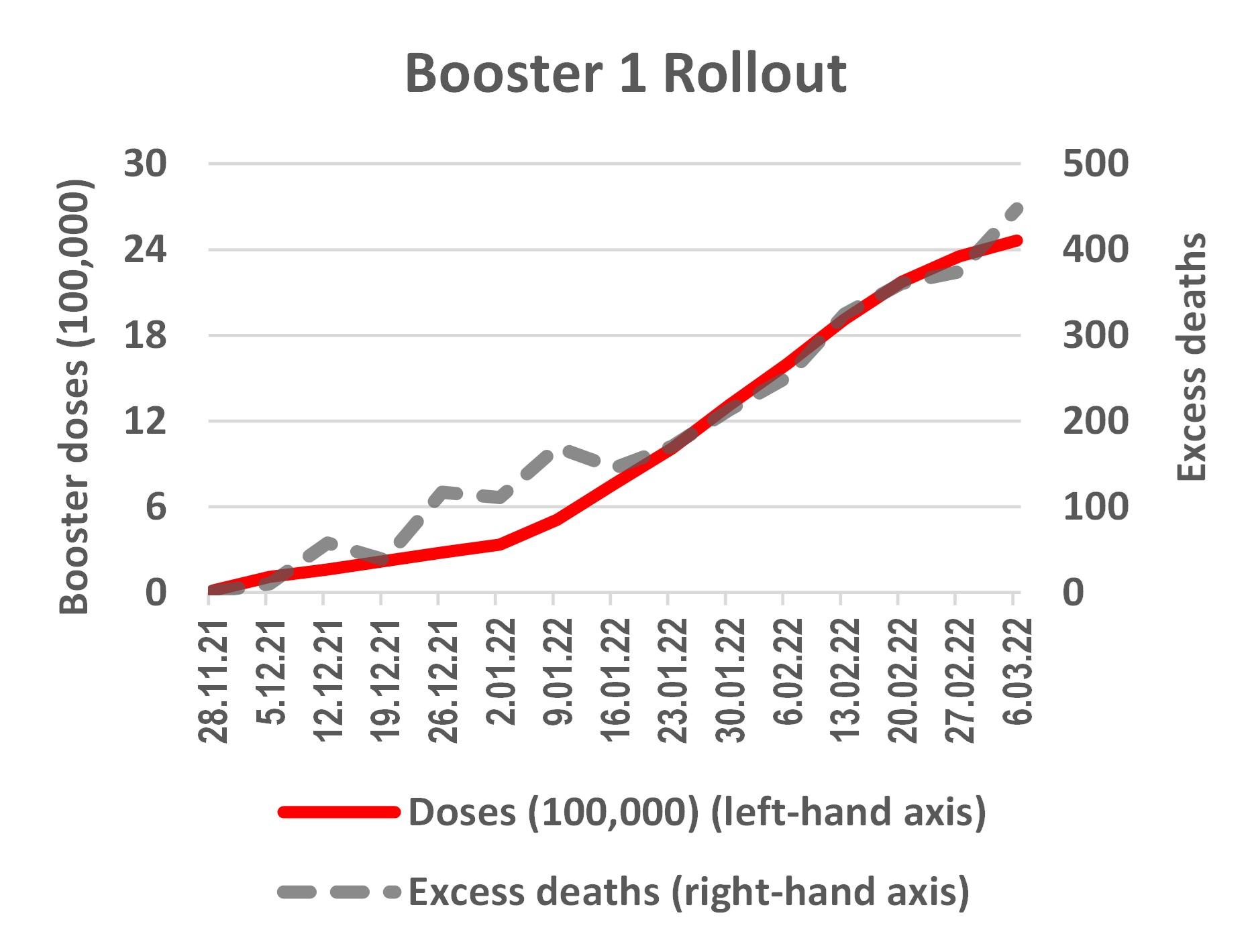
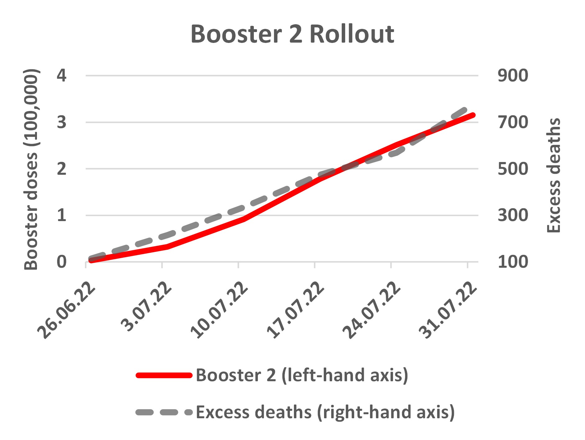
Returning to the New Zealand data, the chart below shows relationships between rollout of the booster doses and cumulative excess deaths. The period shown starts once each booster rollout got over one percent of ultimate uptake; a long prior period of low uptake precedes a concentrated burst of uptake. For example, the first booster dose started to be dispensed in July 2021 but it was not until the end of November that uptake got above one percent. In the next four months, just over 2.5 million booster doses were given and then uptake plateaued.
 |
 |
It is clear that there is a close temporal relationship between increased excess deaths and the rollout of the booster doses. From late November 2021 until the end of March 2022 roughly 2.5 million booster doses were administered and cumulative excess deaths went from zero to just over 400 over the same period. Note that because boosters were generally not available to younger people, the excess deaths shown are for ages 30 and above.
Likewise the second booster rollout, which is still ongoing, had a few doses in 2021 and then a slow increase in the first half of 2022 but it was only late June 2022 when cumulative doses got above 3000, and then in the next month rose to over 300,000. Contemporaneously, there were 700 cumulative excess deaths in this period. Given the age restrictions for the second booster doses, the deaths shown in the right-hand panel are for age 60 and above.
The correlations in the figures are compelling but stronger evidence comes from statistically examining week-by-week changes. Series trending upwards together may spuriously seem related, so it helps to see if changes in the series move together. For the first booster rollout, changes in weekly excess deaths and in vaccine uptake indicate 16 excess deaths per 100,000 booster doses. This estimate also takes account of exogenous variation in the rate of dosing.
It will be some time before similar estimates are available for the second booster rollout, as it has only been underway at scale for a few weeks. Nevertheless, the available New Zealand data show two patterns that have to be explained: a rise in excess deaths coincident with the booster rollouts, which is concentrated in age groups eligible for boosters but not in the age groups mostly ineligible. Delayed effects of lockdown are unlikely to have such patterns.
Finally, readers should note that the relationships of booster rollout with excess deaths shown here are at variance with “observed versus expected analyses” that Medsafe include in safety reports for adverse events following injection of COVID-19 vaccines. Since the 28th report (issued on September 29, 2021) Medsafe use age-specific death rates (averaging over all deaths per age group from 2008 to 2019) for the following calculation: the count of people in each age group given a COVID-19 vaccine dose over a particular period is multiplied by the average death rate, to get an expected number of annual deaths for each cohort. That expected number of deaths is then reduced to a 22-day total (for the day of dosing plus the next three weeks). This provides a denominator and the numerator is what they call the actual number of deaths for people within three weeks of the person being injected with a COVID-19 vaccine.
For example, the latest (44th) safety report, on 13 July 2022, shows that n=349,262 people aged 70-79 got a Pfizer first dose between 19/2/21 and 30/4/22. Based on the average death rate from 2008 to 2019 for 70-79 year olds, Medsafe calculate 492 deaths would be expected in the 21 days post-injection for this age group but only 240 deaths were reported. The claim that deaths post-injection are fewer than expected is made for all age groups except those less than 30 years old. For all-ages combined, Medsafe report actual deaths post injection are just one-half of what would be expected and this claim has made its way into newspaper stories that issue soothing messages about the overall safety of the vaccines.
These Medsafe calculations are quite different to what was observed in the randomized trials of the vaccines, and are also different to what is observed from real world rollouts overseas. Recall that four months post-second dose in the trials, deaths were 25% higher than expected amongst the vaccinees, while shorter term analysis for all mRNA vaccines (pooling trials for Pfizer and Moderna) shows that deaths were 3% higher than expected amongst the vaccinees. A study using population register data for Sweden found that in the two weeks following the second dose the death rate amongst the vaccinated was about 250% of the normal fortnightly death rate for that time of the year for the affected age groups.
One reason the Medsafe calculations give an impression the vaccines are safer than shown by overseas data from randomized trials and population registers is due to use of an out-of-date and misleading death rate for calculating the denominator (the expected number of deaths). In recent years death rates in New Zealand have fallen quite sharply, especially below age 20 and for ages 60-79, as seen in the following figure based on the Human Mortality Database.
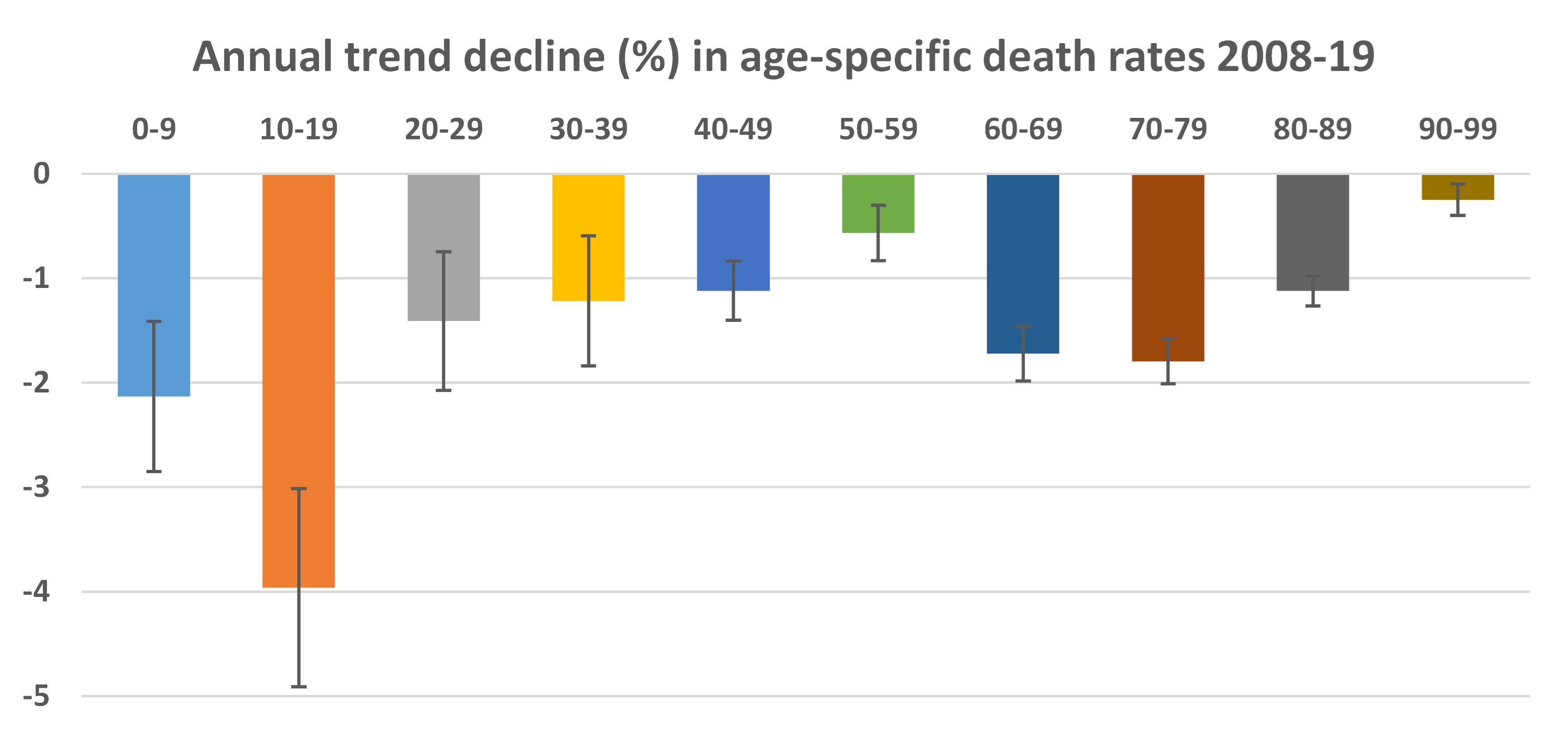
For example, death rates for 10-19 year olds fell at a trend annual rate of four percent over the 2008 to 2019 period. Given this trend, an average calculated from 2008 to 2019 data is a misleadingly high estimate of the death rate that should be expected in 2022. In fact, for the 10-19 year old group, the average death rate from 2008 to 2019 is 37% higher than what is calculated for 2022 when allowing for the trend decline in death rates. For ages 60-79, the death rate based on the 2008-19 average is almost 20% above the death rate that is expected for 2022. (Note that declining death rates are simply a corollary of rising life expectancy, which has recently been going up by about 2.5 years per decade).
So the Medsafe calculations use a denominator for expected number of deaths post-injection which is too high. For example, twelve 10-19 year olds reportedly died in the three weeks after their first dose was administered (out of 583,330 who got a first dose). Medsafe expect 11 deaths, based on their calculations with the 2008-19 average death rate, so the relative risk ratio (12/11) is not statistically significantly different from 1.0. Yet given the trend decline in death rates over 2008-19, a more plausible counterfactual is eight deaths are expected in a three week period, for a cohort of 583,330 10-19 year olds. A comparison between 12 actual deaths and eight expected deaths has a relative risk ratio of 1.5 which is a more concerning signal about lack of vaccine safety than what the Medsafe calculations show.
In addition to this issue with the denominator of the Medsafe calculations, there are reasons to doubt the numerator. This is purportedly the number of people who died within three weeks of being injected with a COVID-19 vaccine. Death certificates in New Zealand do not include the NHI number, which is needed to link up to the vaccination status of each person, and so it is not a straightforward matter to work out who amongst the vaccinated has died in the particular three week period following their injection.
I have been unable to obtain data from Medsafe or the Ministry of Health on how accurately, completely and quickly they are able to match the data on death certificates with other data in order to assign an NHI number. To the extent that matches are inaccurate or incomplete, the count of people dying within three weeks of receiving a dose of the COVID-19 vaccines will be too low. We have already seen that the Ministry of Health were working with inaccurate population denominators that overstated their vaccination rates and so we should be open to the possibility of other types of counting errors affecting their calculations.
To recap, the last eight months have seen 3000 more deaths than expected – an unfolding disaster. Over 1000 of these excess deaths are unrelated to COVID-19 as either an underlying cause or contributory factor. Health authorities and politicians should face more scrutiny over the causes of these unexplained excess deaths. The “observed versus expected” analyses from Medsafe also require more scrutiny because the current approach is unlikely to detect adverse safety signals, partly due to use of outdated average death rates. When posing these questions to health authorities and politicians, a key test of answers they provide is whether they can account for a rise in excess deaths coincident with the booster rollouts, which is concentrated in age groups eligible for boosters but not in age groups that are mostly ineligible.