
1. Income and wealth
There are two kinds of inequality in economic outcomes – inequality of income and inequality of wealth.
Income is a flow of actual spending power; wealth is a stock of potential spending power.
Where does income come from? For households as a whole, a little more than half comes from wages and salaries followed by income from business ownership, benefits, superannuation, and earnings on financial assets.
Where does wealth come from? A small part of wealth may be inherited but almost all comes from a person’s savings and investments over their working lifetime.
2. Different people are different
Human abilities are unequally distributed. Cognitive ability, thinking ability in the sense of learning and problem-solving ability, is generally indicated by measured IQ. IQ is distributed in a bell curve – a normal statistical distribution. Murray and Herrnstein, in their famous book The Bell Curve, demonstrate the links between IQ and all sorts of social and economic outcomes.
Human personalities are different. The Myers & Briggs Foundation has developed a widely known personality classification system. Of the 16 different personality types, even the most common applies to only 14% of people while 1.5% of people are in the least common category.
Education attainment also is unequally distributed. OECD data show that 21% of adult New Zealanders have “below upper secondary” attainment, 41% have “upper secondary” and 38% have “tertiary attainment”. (It is interesting to note that New Zealand has the lowest level of tertiary attainment of all the high-income English-speaking countries.)
Cognitive ability, attitudes, initiative, drive, persistence, reliability and doubtless many other features of individual personality are differently distributed across the population. These differences make it inevitable that there are inequalities in practically every dimension of life. This includes our economy, the generator of income and wealth; as a result, inequality of income and wealth is inevitable.
3. Economic systems
Our economy today is largely a market economy. The market system, or capitalism, or the free enterprise system – whatever one calls it – has brought us to where we are today where everyone has a standard of living vastly better than even a few generations ago. Some people will have done better economically than others but everyone has gained in terms of material standards of living, health, life expectancy, education, leisure time and leisure opportunities.
The market system always leads to differences in incomes. However, government policies have been developed to take the rough edges off these differences. This is the welfare state wherein the government redistributes income, from higher to lower incomes, and simultaneously provides an income “safety net”. These policies in New Zealand go as far back as the Liberal government of 1891 under John Balance and Richard John Seddon, were expanded by the first Labour government starting in 1935 and again by the third Labour government starting in 1972.
There are other governmental systems in the world; all are variants of communism or dictatorships. These systems produce at least as much income inequality as capitalism but at lower levels of income. In communism “all animals are equal but some animals are more equal than others” as George Orwell said in Animal Farm. In dictatorships there is inequality of a different kind – the elite are wealthy and do not care about the rest.
4. International trends
Thomas Piketty, in his famous book Capital in the Twenty-First Century, surveyed the trends in inequality in Europe and the U.S. since the start of the industrial revolution in the 18th Century. His main conclusion is that wealth inequality increased until 1913, then declined until around 1980, and has since been increasing.
Huge inequality in wealth, based on land ownership, was left over from medieval history. Inequality then increased with the Industrial Revolution – which rewarded ownership of the new industries. However, World War I and the crumbling of the old order, the Great Depression and the rise of progressive taxation essentially destroyed inherited wealth over the middle years of the 20th century.
Piketty’s suggestion of increasing wealth inequality since 1980 has recently been thrown into doubt for several countries. There are several reasons for this. First, the increase in widely dispersed “human capital” (wealth in the sense of people’s earning power reflecting their education, skills and experience) has substantially offset the effect of ownership of “physical capital” (land, buildings and machinery). Second, the rise in home ownership has distributed wealth much more widely. And third, the increase in retirement income plans has tended to level the ownership of wealth in the form of future income entitlements.
5. Accumulation of wealth
Most people’s wealth results from saving from their incomes and by the growth of the resulting assets. The principal forms of assets are a person’s residence, other property, bank accounts, business ownership, shares, and retirement income entitlements.
Bryan Perry, in a 2018 Ministry of Social Development report, shows a graph of the average relationship of wealth and income to age for Australian households. This graph shows that wealth accumulation is a “life cycle” process. People start with low incomes and little wealth. As their incomes rise, they save and invest and build up their wealth. Much of this wealth is in owner-occupied residences. Then, in their 60s, people retire, their income declines and they start to draw down their wealth to help support their current expenses.
This process means that income is the key driver of wealth – wealth is accumulated by saving out of current income then investing these savings so that wealth grows over time. This is supported also by New Zealand data – the distribution across households of wealth and of income are very similar (see Perry, Tables A.2 and B.9).
6. Income distribution
The most recent data on the distribution of income in New Zealand is shown in this graph (Perry, Figure 8.1):
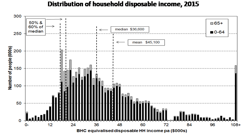
The distribution of disposable incomes for households is shown for householders aged under 65 years (the black lines) and for householders aged 65 and over (the grey lines). 65 years is important as it is the age of eligibility for New Zealand Superannuation. Incomes are disposable, that is market incomes less income taxes plus benefit payments and pensions. BHC is before housing costs.
Clearly there is a wide range of income for under 65s as well as for 65+ people. Both income distributions have a particular shape, bunched at low incomes with a long tail of high incomes. Virtually every income distribution in the world has this shape. Technically, this shape is the Pareto or log normal distribution.
7. How does this distribution compare?
As income distribution is always unequal, and always has this log normal shape, it is useful to ask how the distribution in New Zealand compares to that in other countries. Is New Zealand about average? Is New Zealand more unequal? Is New Zealand less unequal?
This next chart (using OECD data) shows Gini coefficients for 35 higher income countries for 2014. The Gini coefficient is a widely used measure of inequality ranging from 0 for complete equality to 1 for complete inequality.
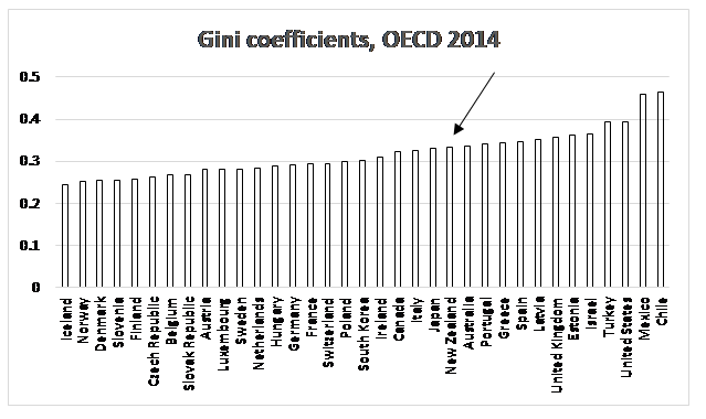
New Zealand’s distribution of income is nowhere near the extremes, of Iceland at the low end and Chile at the high end. In fact, New Zealand’s Gini of 0.33 is just slightly above the average of 0.32 and almost identical to Australia’s Gini of 0.337.
8. Changing distribution
Has New Zealand’s income distribution changed over time? Has it become more unequal?
This figure (Perry, Figure 8.7) shows the trends:
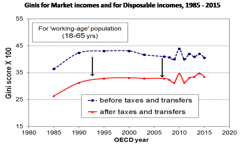
There was a definite increase in inequality in the late 1980s and early 1990s. This was associated with the dismantling of the government-controlled and union-controlled economy. The trend from the mid-1990s (the first arrow in the graph) is relatively flat – very little change. In recent years there has been fluctuation but no real change in trend for market income inequality although there has been a recent slight increase in disposable income inequality.
The next table (using data from Perry, Table K.6) shows the probability of households moving to a lower or a higher income decile over the years 2002 to 2008. These movement probabilities, where “na” is “not applicable” and Decile is the initial income decile, are:
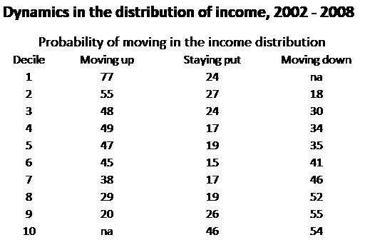
There is substantial flexibility in the distribution of income – in every income decile, a majority of households moved out of their initial decile. There was considerable movement at low and at high incomes – a majority of households initially in deciles 1 and 2 moved up while a majority of households initially in deciles 8, 9 and 10 moved down. Only 2% of households remained in the lowest decile while 5% remained in the highest decile. (Because each decile covers 10% of households, there must have been equivalent movement in the opposite direction.)
9. The top income controversy
There has recently been some controversy about the share of income and wealth going to the top 1% or even 0.1% of households. The next table (using OECD data) shows the broad pattern of wealth ownership in high-income English-speaking countries.
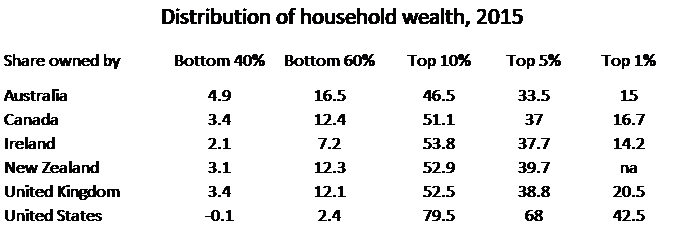
Data for the top 1% is not available for New Zealand but a reasonable indication can be gained from the percentage for the top 5%. In this, New Zealand is similar to the other countries apart from the United States. The U.S. share is the outlier, at 68% compared to shares below 40% for the other countries.
The next figure (Perry, Figure D.13) shows the movement of the P90:P10 ratio. This is income at the top of the 90th percentile divided by income at the top of the 10th percentile. The line relevant here is for BHC (before housing costs) incomes. (AHC is After Housing Costs but housing is a separate issue.) Perry (page 86) gives a good explanation of the meaning of this ratio:
The P90:P10 ratio provides a good indication of the full spread of the distribution, going as far as possible to the extremes without running the risk of being overly influenced by unrepresentative very high incomes or by the difficulties with bottom decile incomes.
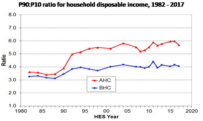
The BHC measure has not really changed since around 2003, or even since 1994. This ratio, just as the Gini, did increase into the early 1990s but in recent times there has been no systematic relative increase in top incomes.
The ratio for New Zealand is around 4.0 and has been steady over recent years. In contrast, the ratio for the U.S. has been increasing and in 2017 was 12.6 (see U.S. Census Bureau).
The controversy about the relatively high income and wealth of those at the top of the distribution might have some factual basis for the U.S. but it does not for New Zealand.
10. The growing economy
Economic growth means that over time everyone becomes better off. For example, total income in New Zealand has increased since the mid 1990s at 5.1% a year, or 2.9% a year inflation-adjusted. In the past decade, median incomes to households receiving wages and salaries, self-employment income, superannuation, and benefits, or all major types of income except for income from financial investments, have been increasing more rapidly than inflation.
Economic growth is, in the jargon, not a zero-sum game. In other words, for some people to get higher incomes does not mean that other people have to receive lower incomes. Economic growth is a rising tide that lifts all boats (incomes). Upper incomes are not high because of expropriation from the poor, they are high because those people contribute more value to the economy.
11. Conclusion
New Zealand does have income inequality but so does every other country. New Zealand’s inequality is middling compared to the higher income countries of the world. In particular, New Zealand’s degree of inequality is virtually identical to that of Australia.
New Zealand’s inequality increased in the late 1980s and early 1990s as the governments of the day unravelled decades of government and union control over the economy. Since that time, however, inequality has changed little.
There is no evidence the that “the rich are getting richer”, that the highest income earners are increasing their income share. Similarly, there is no evidence that “the poor are getting poorer”. The extremes are not diverging. In contrast to well publicised developments in the United States, there is no evidence that the greatest part of incomes gains is going to the already rich.
Inequality does not mean that the rich have taken away from the poor. Economic growth means that, over time, virtually everyone becomes better off. Wealthy people become wealthy as a result of higher incomes, or greater contributions to the economy, not by expropriation. Even those on benefits or NZ Superannuation have shared in the increase in incomes that comes with economic growth.
There is clear evidence that people move within the income distribution, some moving up and others moving down. For example, 77% of lowest decile households moved into higher deciles in recent years while 54% of highest decile households moved down. (By definition, though, an equal number moved down or up to take their place.) This indicates the dynamic nature of incomes and inequality in New Zealand rather than systematic changes in the overall pattern of income distribution.
References
Murray, Charles A. and Richard Herrnstein. The Bell Curve. Free Press, New York. 1996.
Myers & Briggs Foundation. How Frequent Is My Type. www.myersbriggs.org. Accessed 15 February 2019.
OECD. Income Inequality by OECD Country, 2014. Statistics and Data Directorate. Income Distribution Database.
OECD. Release of OECD Inequality Update 2016. Statistics and Data Directorate. Income Distribution Database.
OECD. Adult Education level, 2017. OECD. Data. Education.
OECD. Inequalities in household wealth across OECD countries. Statistics and Data Directorate, Wealth Distribution Database, Working Paper No. 88. 2018.
Perry, Bryan. Household incomes in New Zealand: Trends in indicators of inequality and hardship. 1982 to 2017. Ministry of Social Development. Wellington. October 2018.
Piketty, Thomas. Capital in the Twenty-First Century. Belknap Harvard, London. 2013.
Orwell, George. Animal Farm. Penguin Essentials, London. 2008.
U.S. Census Bureau. Historical Income Tables: Income Inequality. Washington D.C., 2018.